Key takeaway: If your website looks different on every screen, it’s not broken, it’s responsive. Modern websites automatically adjust to fit phones, tablets, and desktops so your customers always see the same message, just perfectly sized for their device.
Marketing Insights
Teamwork Blog about marketing and business
YES - social media posts can show up for core key terms! Social media posts can now give your business extra visibility in search - including branded searches and generic searches.
With over 105 verified 5-star Google reviews, Teamwork Solutions Group is now recognized as the highest-rated marketing agency in Lafayette, Louisiana.
Looking for expert marketing in Youngsville? Teamwork Solutions Group helps businesses in Yougsville grow with tailored digital marketing strategies that actually work.
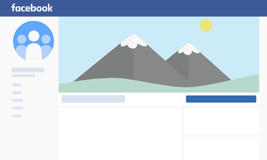
Have you ever spent way too much time trying to crop an image for your Page's cover photo, only to realize that it still doesn't look quite right?


