Why Your Website Looks Different on Every Screen | Mobile-Friendly Website Design Explained
 “My website looks different on my phone!”
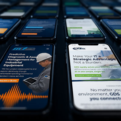
Over the years, we’ve noticed that many clients get confused when they pull up their website on a phone and see something that looks a little different from what they see on their computer. The buttons might move, the menu might collapse, or the layout might shift, and it’s easy to assume those are two separate versions of the site.
It’s actually the same website adjusting itself to fit the screen, which is exactly what a good, mobile-friendly web design should do.
One website, many screens: Your site adjusts automatically to fit each one
What’s really happening is something called responsive website design.
Instead of having separate “mobile” and “desktop” versions, a modern website is built to automatically adjust to the screen size of the device being used, whether that’s a large desktop monitor, a tablet, or your phone.
Every element on your site, the text, images, and buttons, is designed to shift and resize so that it’s easy to read and interact with, no matter what kind of screen your visitors are using. The goal is to make your site feel natural and simple to use everywhere, without extra work or extra versions.
Sometimes, additional content or sections may be hidden on smaller screens, especially on the homepage, so that mobile visitors see a cleaner layout with clear calls to action like calling your business or finding directions.
A well-built, mobile-friendly web design ensures that your brand and message stay consistent from one device to the next. The only thing that changes is the layout, not the content or quality.
How your website behaves on desktop vs. mobile (PC vs Your Phone)
When you open your website on a desktop computer, there’s usually plenty of space for large images, wide layouts, and navigation menus that stretch across the top of the screen. That version feels open and spacious because it’s designed for a big monitor.
On your phone, space is much more limited. The same content has to fit into a smaller view, so your website automatically rearranges itself. Menus collapse into a simple icon, columns stack vertically, and images resize to fit neatly on the screen. Buttons and text often become larger so they’re easier to tap and read. Some sections may even be hidden altogether to keep the layout clean and focused on what matters most.
These adjustments don’t mean you have a different website, they mean your website is doing what it’s supposed to. A mobile-friendly website design makes sure your visitors can easily see, read, and interact with everything, whether they’re on a PC, tablet, or smartphone.
Why this matters for your business

Even though most visitors still browse from a desktop computer, mobile traffic continues to grow every year, and for many people, it’s the first way they’ll check out your business. Whether they’re looking you up quickly on their phone or spending more time on a desktop later, your website needs to feel consistent, fast, and easy to use everywhere.
If a site feels clunky or incomplete on mobile, it can create doubt before a customer ever calls or clicks. On the other hand, a design that scales smoothly between devices builds trust and makes your business look organized and up to date.
Google also considers mobile performance when ranking websites, so a mobile-friendly web design helps your visibility even if most of your audience still uses a computer. The goal isn’t to favor one screen over the other — it’s to make sure your website works reliably across all of them.
Common Questions Clients Ask Us
When it comes to this issue clients ask us a wide variety of questions on ths topic.
| Question | Answer |
|---|---|
| Why does my website look different on my phone than on my computer? | It’s the same website, just adjusting automatically to fit each screen. This is part of responsive, mobile-friendly web design, and it helps everything stay readable and easy to use no matter what device someone is on. |
| Do I have a separate mobile version of my website? | No. Modern websites only need one version. Your site rearranges itself based on the size of the screen, but the content and overall design remain the same. |
| Why do some sections disappear on my phone? | Smaller screens have less space, so certain visuals or secondary content may be hidden to keep the layout clean and focused. This helps mobile visitors quickly find the most important actions like calling your business or getting directions. |
| Do I need to worry about mobile visitors if most of my customers use a computer? | Yes. Even if desktop leads in your traffic, mobile use continues to grow, and Google uses mobile performance to evaluate your website. A site that works well everywhere sends the right message about your business. |
Need help with your Mobile Website Design?
Teamwork Solutions Group is a full-service web design agency based right here in Lafayette, Louisiana — and we can help you sort all this out if it feels a little too complicated. From website design, development and hosting to a complete marketing strategy, our team helps businesses get real results locally and nationwide.
Schedule a consultation


