The 10 Requirements for a Successful Landing Page

Landing pages are pages on your website that are meant to convert visitors into leads. These internal website pages contain lead forms that require people to provide their contact information in exchange for something of value, otherwise known as an offer.
Since landing pages are major touchpoints to convert leads into clients, these pages need to be well-thought-out and designed with a purpose. Below are the top ten specific elements that every successful landing page should have, regardless of the product or service you're trying to promote.
1. Enticing Headline
Headlines are the first element that every landing page should have, and they're usually the first thing that viewers will notice. Your landing page's headline should be a short message that communicates the value that your offer will provide to users. Additionally, this value can be all the difference in turning a lead into a client who otherwise would have clicked off of the page.
2. Images
We strongly encourage businesses to include at least one corresponding image for their landing page's offer. An engaging graphic is more likely to trigger emotions in visitors than just plain text. Images also offer an opportunity to establish your brand voice with viewers and showcase a more humanized side of your business.
Make sure that any images you use are appropriately-sized, optimized for mobile, and contain alt text.
3. Engaging Content
Content, otherwise known as copy, is any text on your landing page that communicates to your readers. Well-designed copy will be informative, trustworthy, provable, and compelling. Show that you understand the reader's problem, offer your solutions, and build trust for your brand. Remember, the best way to deliver great content that visitors will engage with is to stay empathetic.
When explaining the solution that you're offering, speak directly to the reader by using words like "you" and "your." Mention the most significant features and benefits of your offer and how they'll improve the viewer's life. Include social proof when possible, as social reassurance can be a significant driving force for turning leads into clients.
4. Contact Form
Unique lead capture forms are a necessity for any landing page. Otherwise, it's not technically a landing page! With a lead form, you can track who shows interest in your offer and where they're interacting with other content across your site. Ultimately, forms allow you to nurture leads into clients and continue to track their buyer's journey.
Your lead form should be placed strategically on your landing page. The best lead forms are usually anchored to the top of the page and may even scroll as the viewer scrolls. Always remember to put the lead form in a readily accessible spot on your page, one that isn't difficult for viewers to find.
5. Call-to-Action Button
The call-to-action (CTA) is one of the most important aspects of any landing page. CTA buttons motivate the viewer to move forward, whether that be signing up for your newsletter, downloading a content offer, etc.
It's essential to use words that encourage action and clearly tell your visitors what to do, like "Submit", "Download" or "Sign Up". The design of your button is just as crucial as the verbiage you choose; make sure your button stands out and contrasts with the other colors of the page.
6. Value-Driven Offer
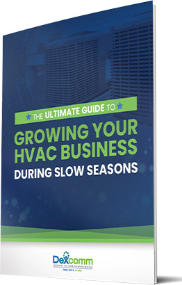
Your landing page needs to offer something of value to visitors that will motivate them to exchange their information. Typical offers include e-books, whitepapers, newsletters, and other exclusive digital content.
Keep in mind that the amount of information you ask visitors to provide in your contact form should be in sync with the value they're obtaining. Meaning, the more fields that someone has to fill out, the more value they should feel they're receiving.
A good, basic rule of thumb is to start with asking for their email address and go from there.
7. Eliminate Internal Links
Remember to keep in mind that your landing page is there to do one thing: convert visitors into leads. We suggest refraining from having any links to other parts of your website that could cause viewers to click off your landing page.
An exception would be including a link to your website in your logo at the top of the page. The thank-you page is a better place to include internal links, specifically to additional relevant content that the viewer would enjoy.
8. Responsive Design
Make sure your landing page is responsive, meaning it adapts easily to different viewing experiences. Responsive design allows your page to remain functional and efficient on a variety of screens, including desktops, tablets, and especially mobile devices. According to Google, more than half of all web traffic is now coming from smartphones and tablets.
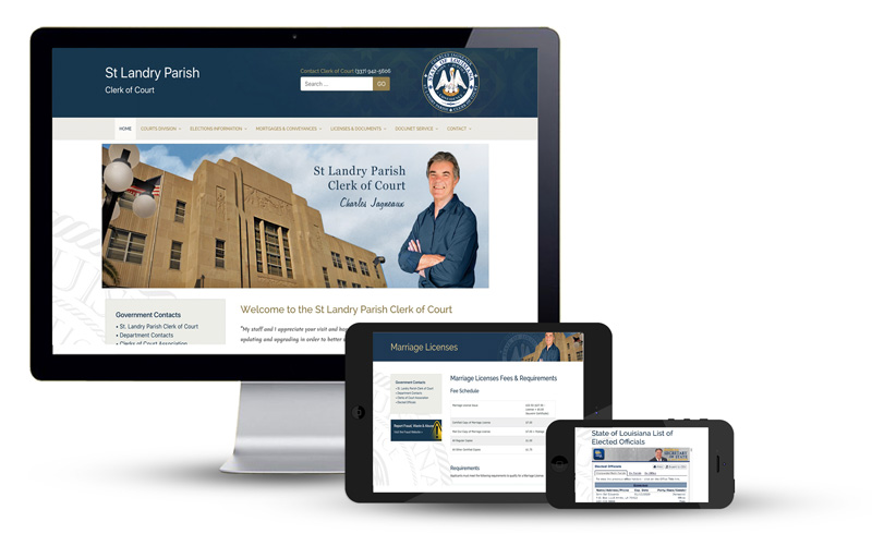
When a website offers a great user experience, it can instill trust and professionalism in a brand for those who browse the site. On the contrary, inefficient or hard-to-use website design will leave users feeling frustrated and can instantly tarnish their opinion on a brand.
9. Search Optimization
Every landing page should be optimized for search with specific keywords and phrases relevant to what the page is offering. A large number of people find landing pages by simply searching for a solution to their problem on a search engine, usually Google.
Would you rather your website be on the second page of Google search results, or in the top 3 of the first page? Optimized search will result in more people seeing your landing page, therefore resulting in higher odds of someone becoming a purchaser. If promoting the page using paid ads, it helps to include the same keywords in your landing page copy that you used in the initial advertisement.
10. Thank-You Page
The thank-you page is the page that leads are directed to after they have successfully filled out the landing page form. Thank-you pages are excellent opportunities to showcase more content that you think would provide additional value to the lead.
Before promoting additional content, remember to use this page to thank visitors for providing their information in exchange for the offer. Saying a simple thank-you goes a long way both consciously and subconsciously for potential clients. Be sure to be clear about how the viewer can access their downloaded content in the future, or whether or not there are additional steps involved.
By utilizing the above elements and making sure they're being executed correctly, your business can start to develop more leads in no time. Keep in mind that tracking your conversion rates will be vital for continued landing page success, as well as using a robust Customer Relationship Manager like HubSpot.
If you're ready to start growing your business using proven online marketing strategies, contact our team today! Our growth experts specialize in a variety of digital marketing strategies, including landing page design and promotion.


